Google applications on iOS have long been criticized for not feeling native to the platform. Earlier this year, the company’s designers reviewed their approach for developing iOS apps and opted for a change.
Google apps on iOS have long looked and functioned near identically to their Android counterparts. That in itself is fine and the company’s prerogative, but Apple enthusiasts have complained about Google applications not respecting common iOS conventions and “feel,” thus resulting in an inconsistent user experience between first and third-party clients.
Behind the scenes, this was due to the company’s belief in “shar[ing] UI components across Google.” In building their own libraries, another focus was “filling gaps in UIKit,” Apple’s framework for building apps.
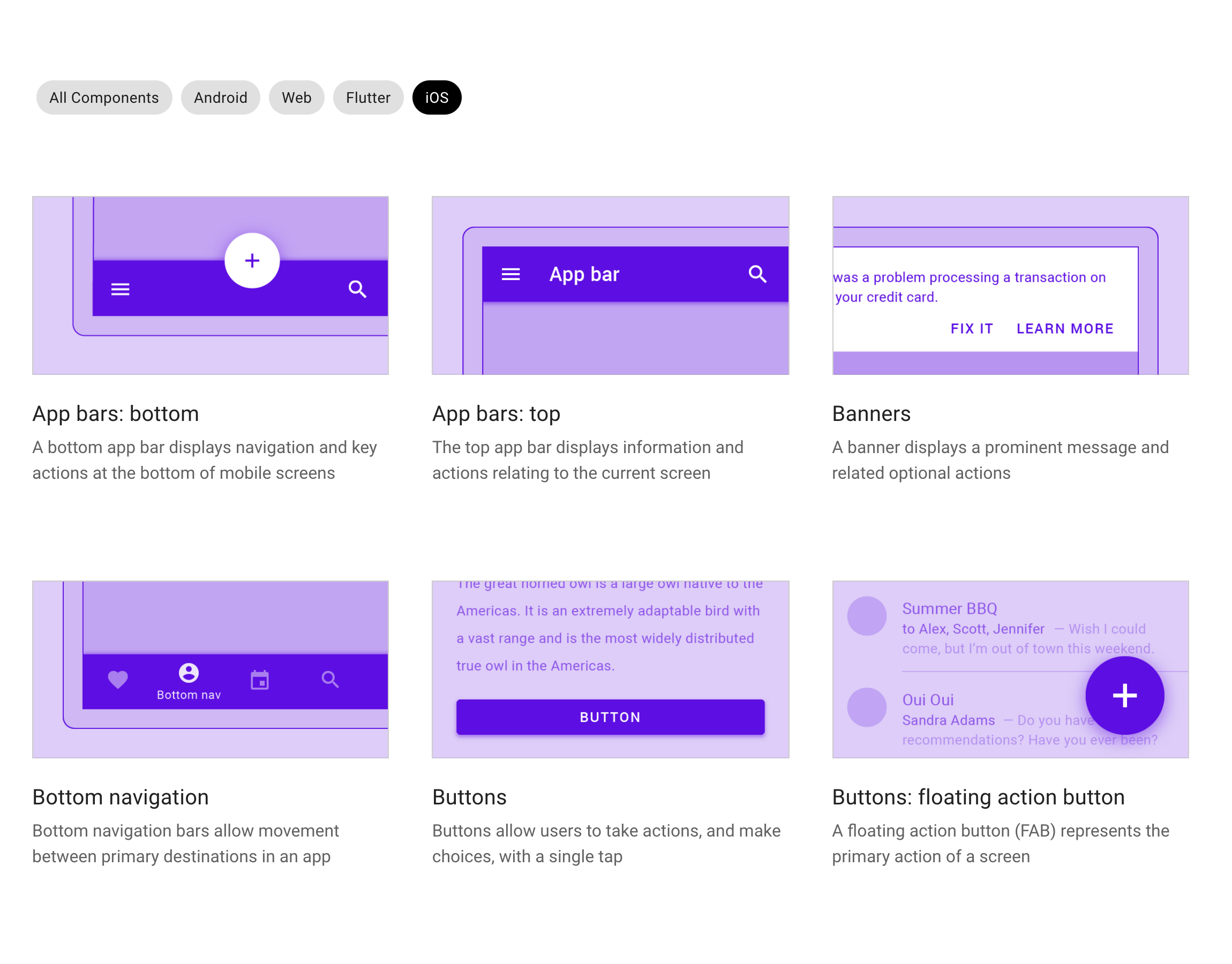
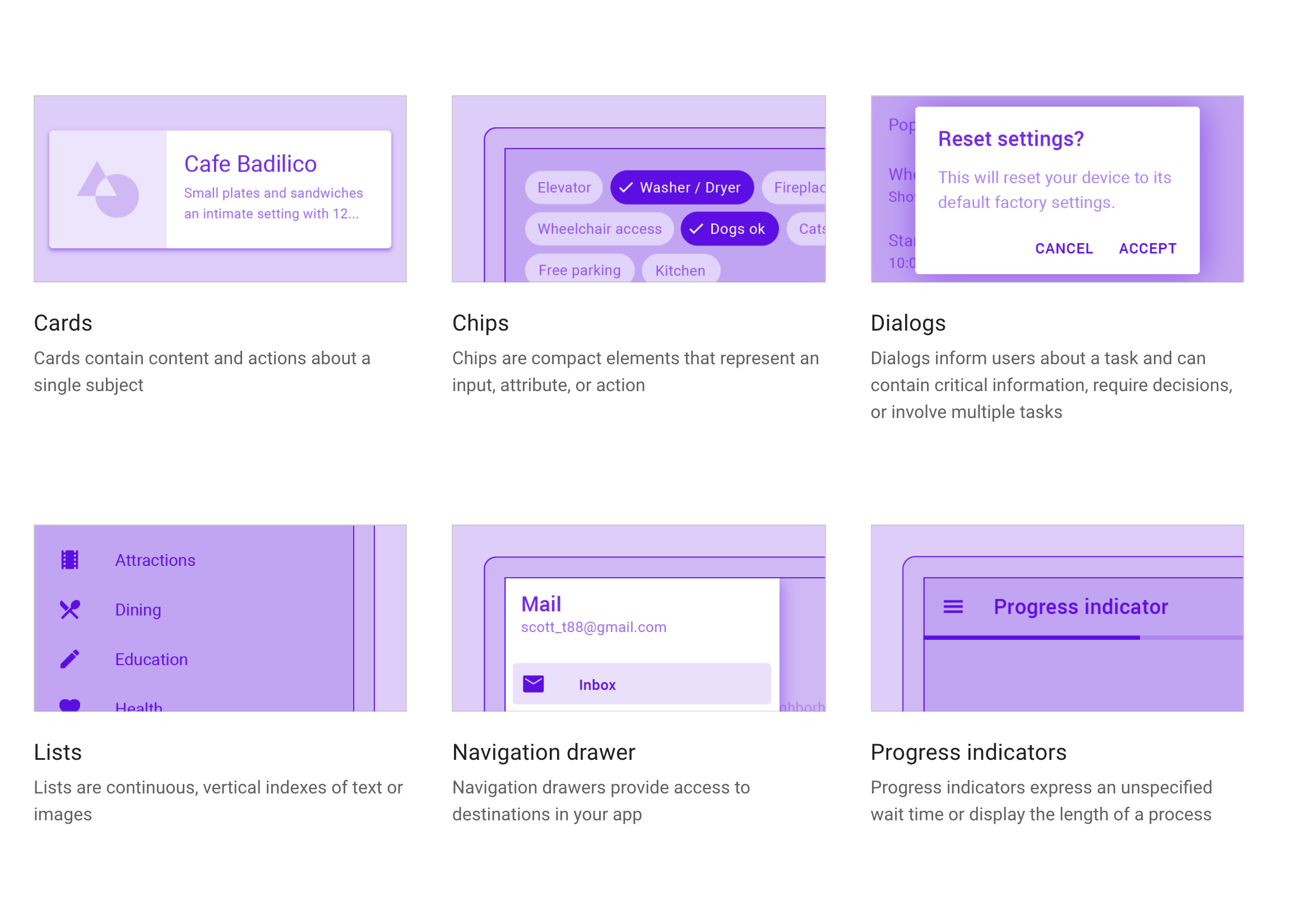
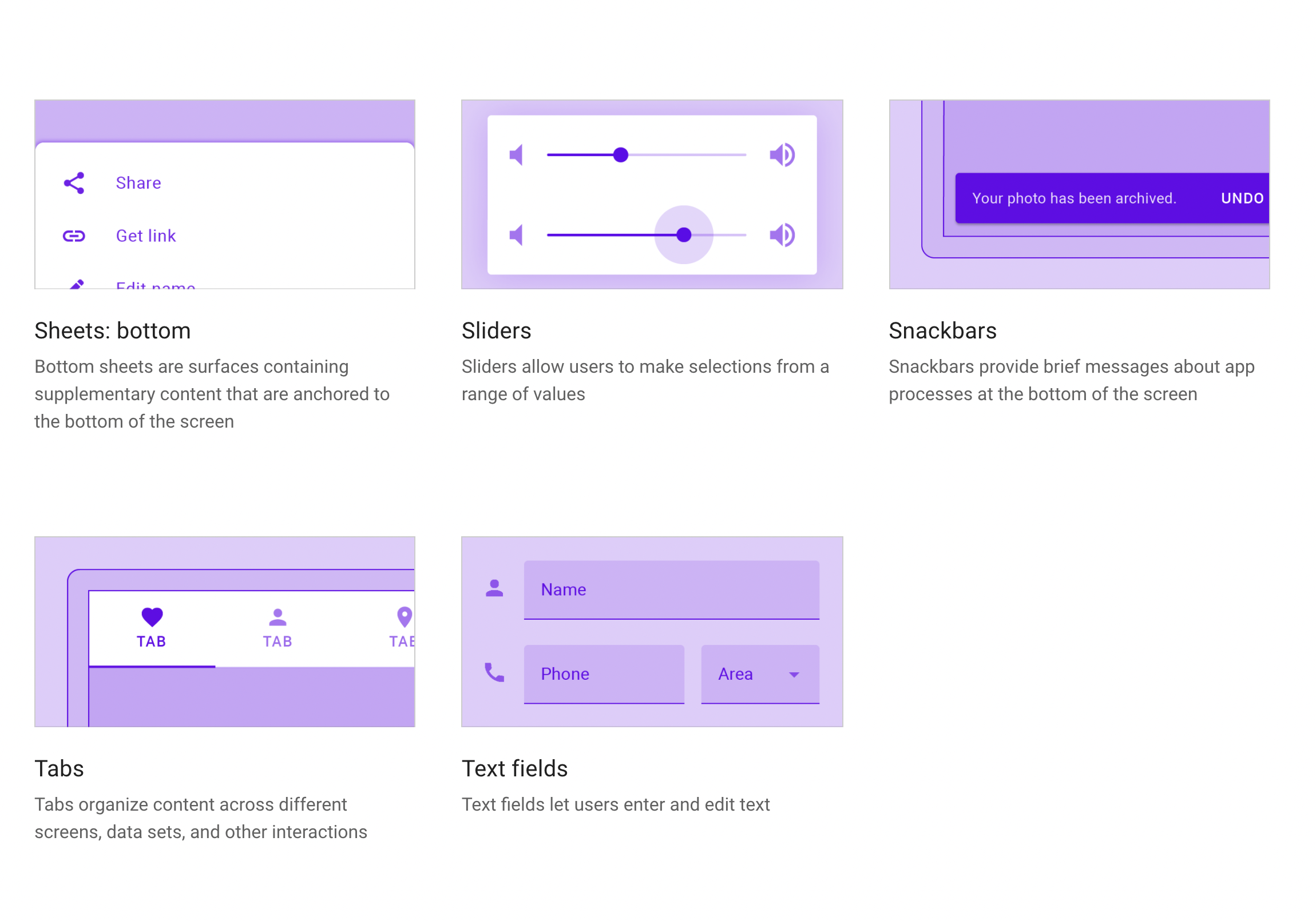
This is according to the staff engineering lead for Google Design on Apple platforms Jeff Verkoeyen in a Twitter thread earlier this week. All that work was eventually open-sourced as Material Components for iOS (MDC) to allow any third-party developer to adopt the same UI elements used by Google’s iPhone and iPads apps, like floating action buttons (FABs), chips, and snackbars.

But as we continued on the pursuit of cross-platform pixel parity, our iOS components were slowly drifting further and further from Apple platform fundamentals because those fundaments were also evolving year over year.
In response, Google at the start of 2021 “began a deep evaluation of what it means to build a hallmark Google experience on Apple platforms,” and asked:
Does a switch really need to be built custom in alignment with a generic design system? Or might it be sufficient to simply use the system solution and move on?
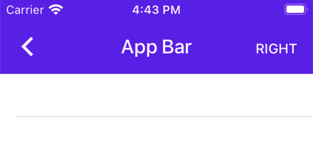
Google concluded that it was time for the latter route, and that Apple’s UIKit had matured enough for internal needs. The company no longer had to maintain most of the custom components that it built out over the years, including app (top) bars, lists, and menus.
Instead, it will adopt standard controls and apply “light branded touches” to maintain the Google look on iOS. Some custom components are still needed, and they will now benefit from “more attention and focus.” It remains to be seen how much (or even if) Google’s iPhone apps will diverge from the Android versions.

As part of this shift, Google in July put Material’s iOS libraries in “maintenance mode.” New releases and bug fixes will be limited, with documentation no longer updated. The company’s official guidance to past developer users is to “follow Apple’s Human Interface Guidelines and consider using modern UIKit components or SwiftUI instead.” That said, it also plugged Flutter as the way to “get a Material look and feel across all platforms.”
Besides the feel of apps, Google has been quick to adopt recent iOS capabilities. This includes widgets for most major services and support for becoming the default browser or mail client. In fact, the Google Photos widget first debuted on iOS last year before coming to Android this August.
Meanwhile, it remains to be seen how Material You will impact Google apps on iOS. On Android, Gmail, Calendar, Docs/Sheets/Slides, Drive, Keep, and Meet have all been updated to Google’s personalized design language. Navigation is unchanged, but there are tweaks to various navigation elements, like the circular FAB turning into a rounded square. However, the bigger change is Dynamic Color where the entire app adopts a color palette based on your wallpaper. It’s unlikely that DC will come to iOS, and updated apps will just end up using a blue tint, like on older versions of Android.


FTC: We use income earning auto affiliate links. More.
